City of New York
Department of Innovation and Technology
NYC Digital Service
With
Kesone Phimmasone, Chief Digital Strategy Officer Gina Kim, Design Director
Will Zhang, Design Lead
Aamina Ganser, Service Design Lead Benjamin Sack, Lead Digital Strategist Ramya Rao, Senior Product ManagerMichael Mausler, Full Stack Developer Andrew Hearst, Information Architecture Consultant James George, Analytics Consultant
New York City’s digital presence spans hundreds of websites, services, and applications. Despite their shared public mission, these platforms lacked a unified brand system, resulting in inconsistent experiences that dilute the city’s voice and create confusion for users.
As Brand Design Director, I worked to unify the identities of NYC’s digital ecosystem. In close collaboration with the NYC Digital Service, I developed a brand framework aimed at improving usability, accessibility, and public trust in city services—all while respecting the autonomy of each agency.
The result is a strategic and adaptable design system that helps agencies communicate more clearly and cohesively with the public. It empowers teams to deliver services that not only function well—but feel connected, credible, and human. This work lays the foundation for a more unified NYC digital presence, ensuring that the design of public services reflects the needs, values, and diversity of the people they serve.
Design Principles
The following principles were used to evaluate and align design and implementation decisions.
EASY FOR EVERYONE
Design and test with real New Yorkers across our diverse city to continually improve content and interactions.
Guide New Yorkers to achieve their objectives in their context, no matter their ability, experience, or resources.
Keep communication simple, timely and relevant.
Design and test with real New Yorkers across our diverse city to continually improve content and interactions.
Guide New Yorkers to achieve their objectives in their context, no matter their ability, experience, or resources.
Keep communication simple, timely and relevant.
TRUSTWORTHY
Enable New Yorkers to reliably get what they need from city government.
Understand expectations and meet or exceed them.
Present information in a truthful manner.
Avoid using AI-generated content or content that changes the original context.
Enable New Yorkers to reliably get what they need from city government.
Understand expectations and meet or exceed them.
Present information in a truthful manner.
Avoid using AI-generated content or content that changes the original context.
FUTURE FORWARD
Build flexibility into design and technology to meet New Yorkers’ changing needs.
Design for continuity not uniformity by starting with shared values and solutions.
Embrace data and evidence to proactively support New Yorker needs.
Build flexibility into design and technology to meet New Yorkers’ changing needs.
Design for continuity not uniformity by starting with shared values and solutions.
Embrace data and evidence to proactively support New Yorker needs.
Logo Lockup
New York City’s most recognizable brand asset is its logo, originally designed in 2007 for NYC & Company, under Mayor Michael Bloomberg.
This logo was created to improve user experience by bringing consistency to the way the City government presents itself to the public. However, the original identity did not sufficiently define standards for contemporary website performance, and many variations of this logo currently appear throughout the city’s digital ecosystem.
This work builds on the original identity, but only to address the specifics of how it should perform across the NYC digital ecosystem today.
This project defines a series of configurations to represent various programs, departments, initiatives and partnerships of our city government. These examples illustrate how the agency name complements the NYC block logo.
NYC Law 30 mandates that all City communications be available in 10 of the most spoken languages based on census data: Spanish, Chinese, Russian, Bengali, Haitian, Korean, Arabic, Urdu, French, and Polish.
While the original NYC identity used Helvetica as its primary text typeface, this system uses Noto Sans—a global font collection that supports Latin, non-Latin, Cyrillic, and Greek writing systems.

STACKED LOCKUP

SIMPLIFIED LOCKUP
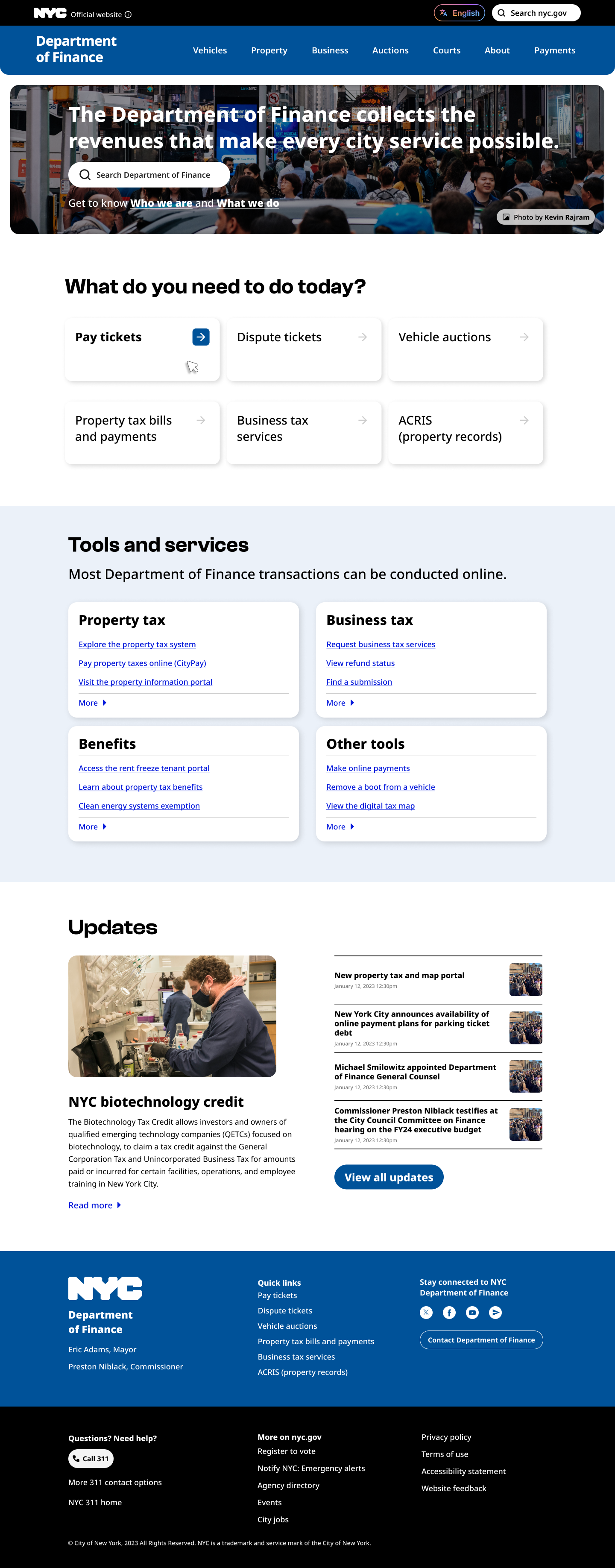
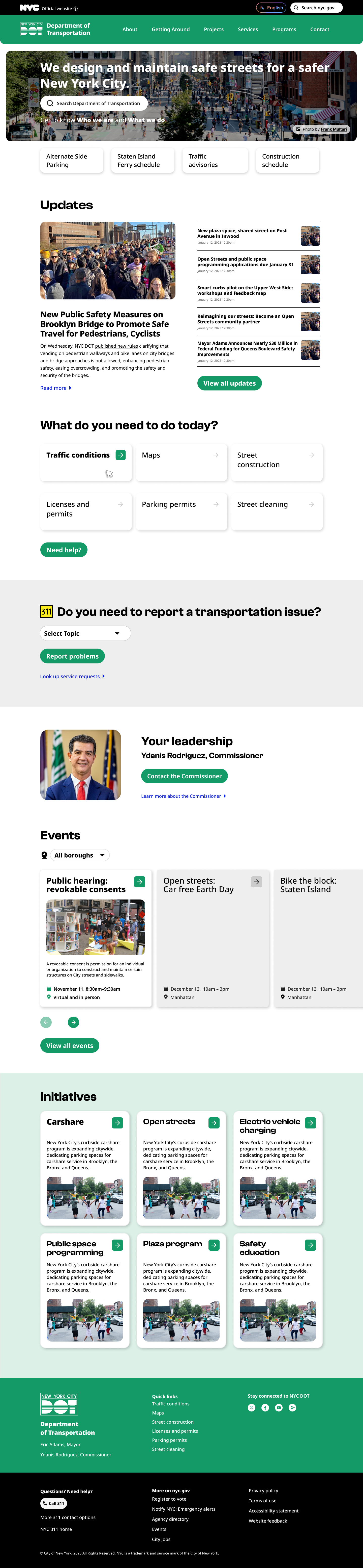
Network Navigation
Ways that branding plays out across website navigation and footer
 DESKTOP CORE SITE NAVIGATION
DESKTOP AGENCY SITE NAVIGATION

DESKTOP AGENCY SITE NAVIGATION WITH BRANDING
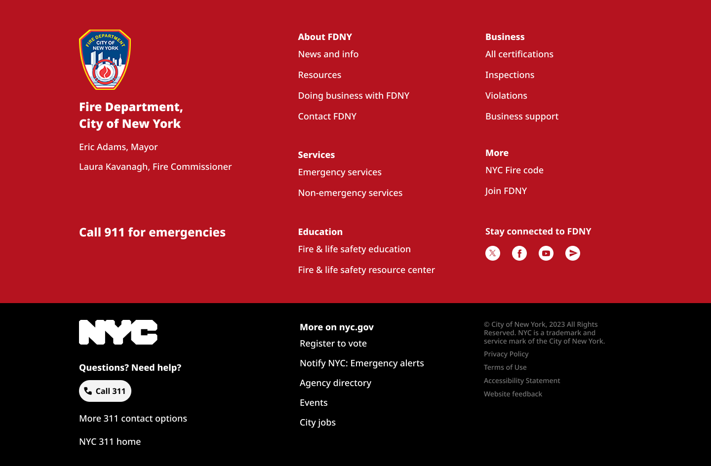
AGENCY WITH EXPANDED FOOTER
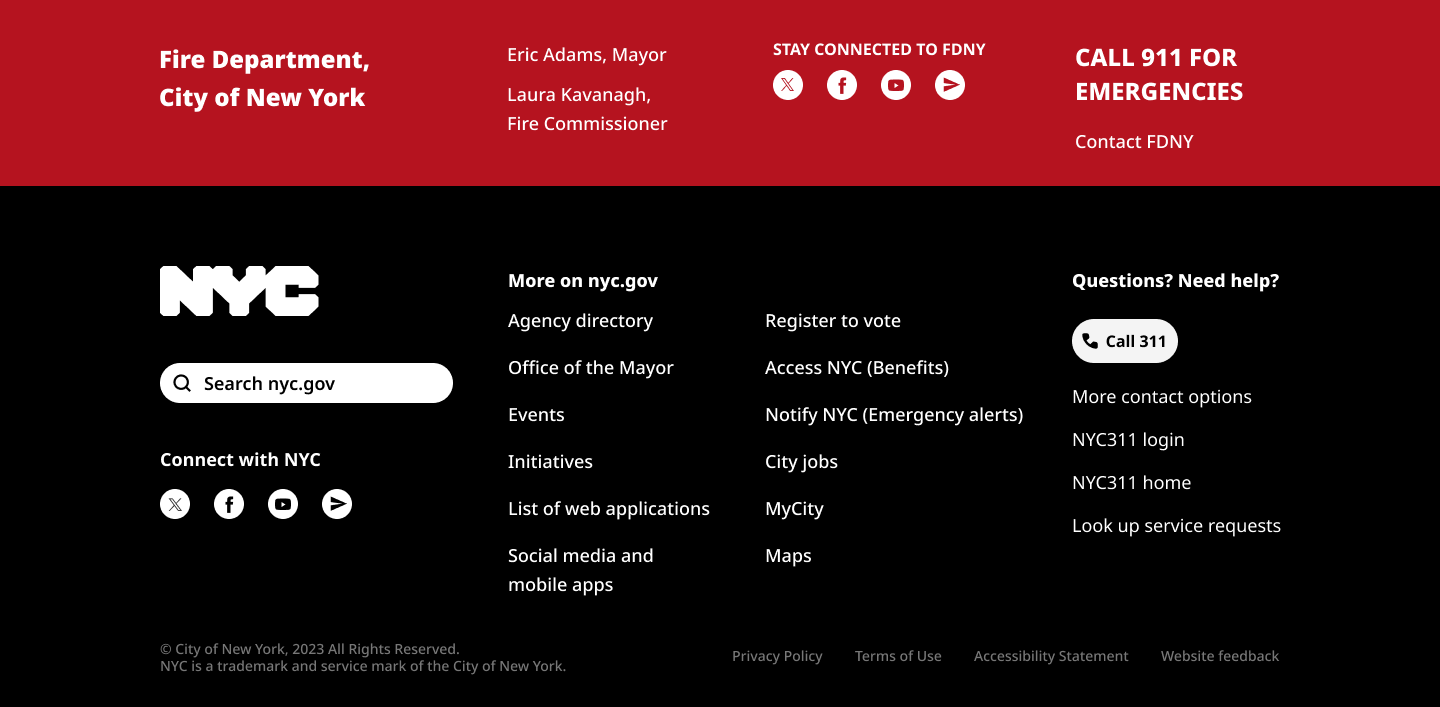
AGENCY WITH CONDENSED FOOTER
Digital Network Design Explorations
The black Core Navigation bar acts as a consistent frame across all city agency websites, providing a unified user experience. The system enables agencies to emphasize or de-emphasize their branding and content as needed—balancing citywide cohesion with individual agency needs.

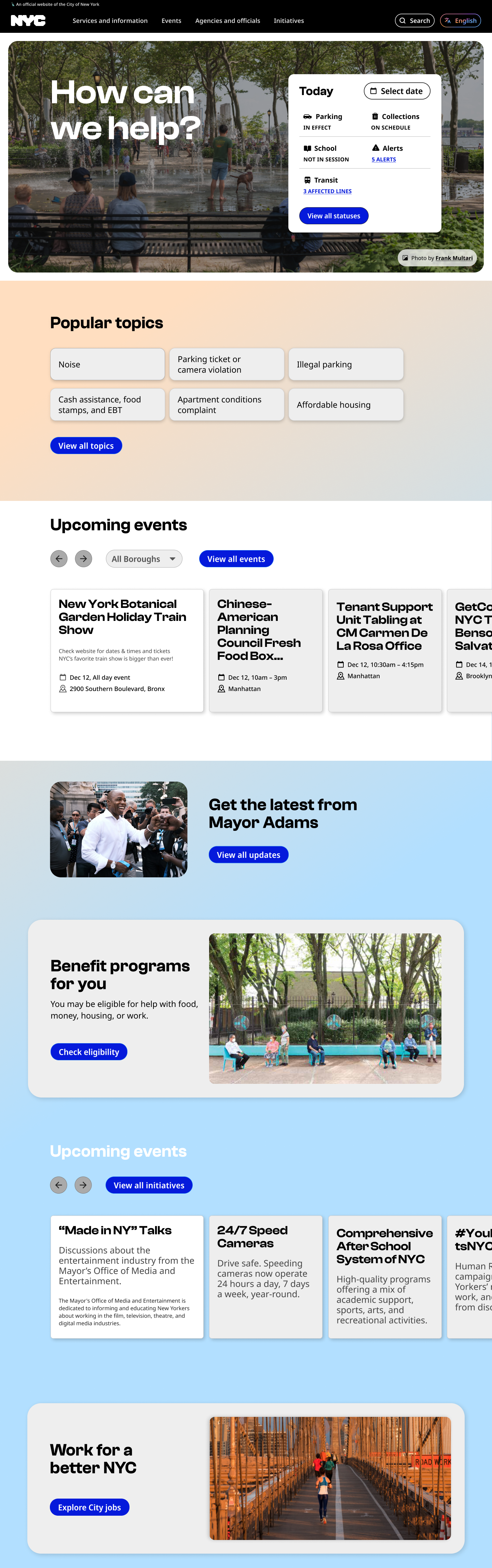
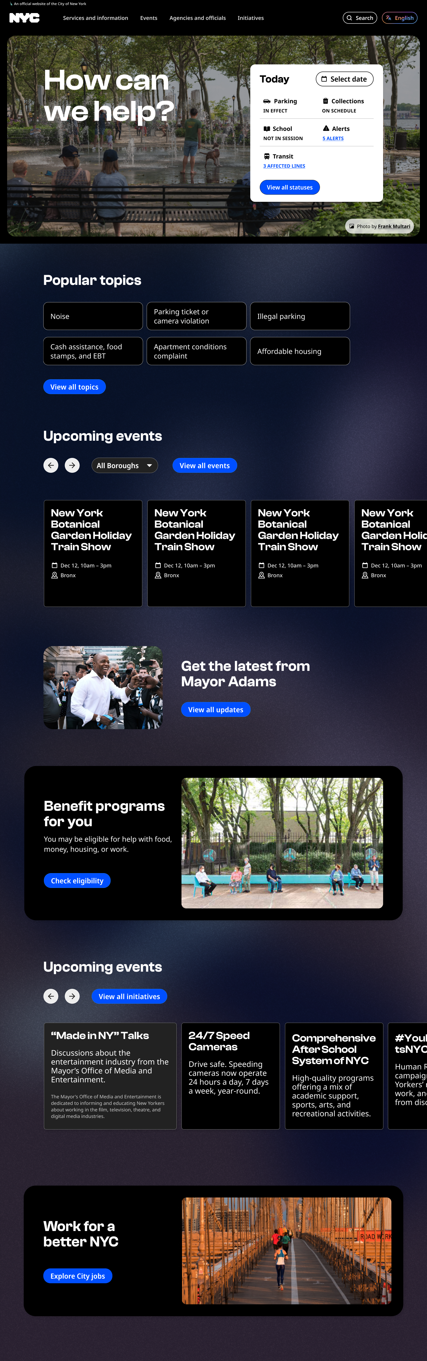
Homepage Concepts
Our team developed this design exploration which reimagines the NYC.gov homepage to shift between day and night modes, aligning with the rhythms of everyday New Yorkers. The interface changes in real time—adapting color, tone, and visual details—to reflect the city’s 24/7 energy.
Rooted in the idea that civic design can be both functional and human, this concept brings warmth, personality, and emotional resonance to a platform used by millions. It’s a simple gesture with big impact: a digital city hall that feels alive.
Rooted in the idea that civic design can be both functional and human, this concept brings warmth, personality, and emotional resonance to a platform used by millions. It’s a simple gesture with big impact: a digital city hall that feels alive.